周末在家没事,做了两个数据可视化的echarts图表,学到了很多有关echarts的知识点。现在总结一下,供各位同学一起学习,成长。
需求
图表的练习 一、深入学习echarts5,并总结 二、做一个练习 1、使用dataset 2、总结一下公共的配置 3、react技术栈,ts语言 4、组件使用antd 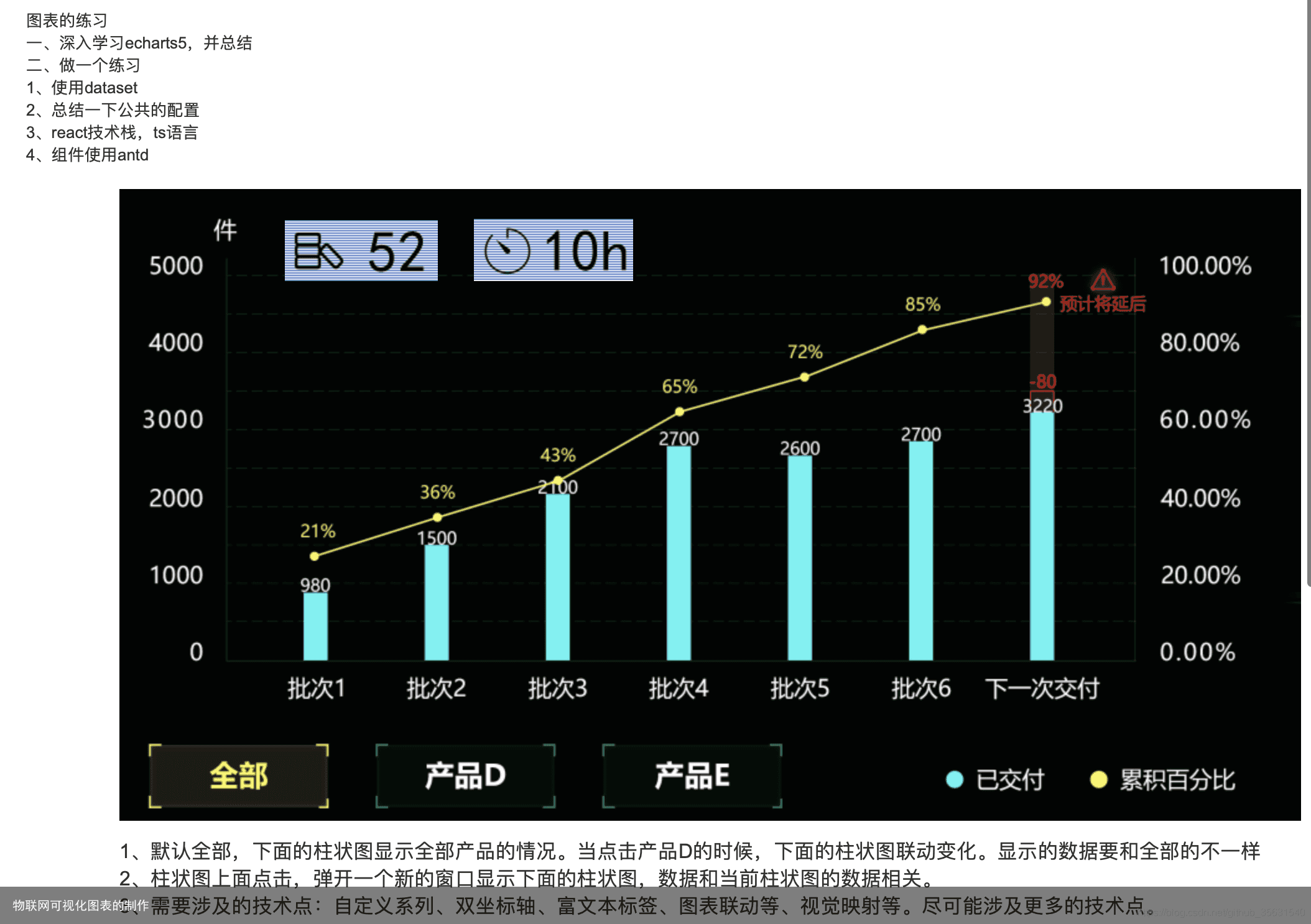 图1-1
图1-1
 以上为图1-2
效果图
 以上为 图2-1
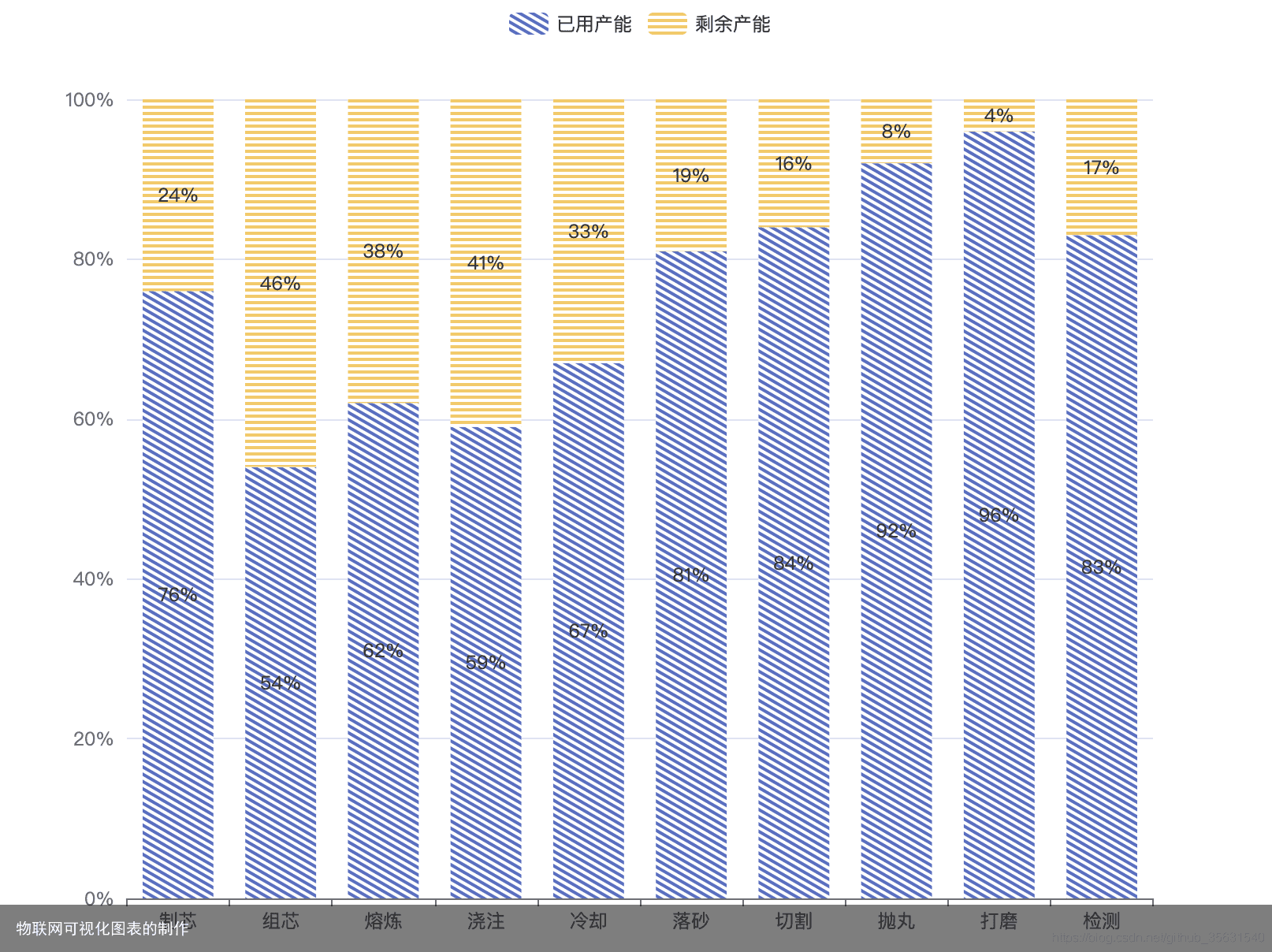 图2-2
图2-2
思路
分析需求图1-1
首先是需求图1-1. 是一个典型的双y轴,柱形图加折线图。可以使用这个案例来改造。 折柱混合 双y轴的话 主要是使用下面代码配置 yAxis: [ { type: value, name: 水量, min: 0, max: 250, interval: 50, axisLabel: { formatter: {value} ml } }, { type: value, name: 温度, min: 0, max: 25, interval: 5, axisLabel: { formatter: {value} °C } } ],
对于图表中一些自定义的元素,如,右上角的二个元素,如下图3-1  这两个元素可以使用 echarts中的 graphic 的 elements 属性。 如下图 3-2时对 graphic 属性的简短解释。可以使用这个属性将一些图片,文本,圆,线,多面图,矩形,线,元素群组,添加到图表的指定位置。
 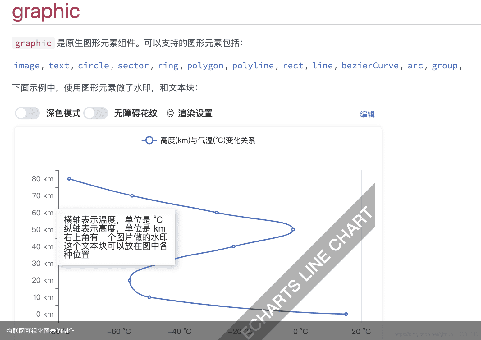 此外由于该图表有二个产品,一个全部。所以使用的是dataset的数据源来存储图表的数据。
如下是全部产品的数据 const dataseSource = [ [product, 已交付, 累计百分比], [批次1, 850, 21], [批次2, 1500, 36], [批次3, 1800, 43], [批次4, 2700, 65], [批次5, 2600, 72], [批次6, 2700, 85], [下一批次, 3220, 80], ]
点击产品D,或产品E ,只要修改数据源,重新设置图表options就可以了。
此外还有一点,就是折线图的label属性是个动态值,大于50,字体变红,并增加一个警告图标。 此方案是这样实现的,主要是用 label中的rich 属性与 formatter属性. rich 用于设置样式,就像为css中的class增加样式。 而 formatter 则可为不同的折线点,设置不用的样式。使用这种写法 {b| value} b为样式的名称,value为要显示的文本,或值。 { name: 累计百分比, type: line, label: { show: true, distance: 5, rich:{ red:{color:red,fontSize:14}, b: { backgroundColor: { image: https://img-blog.csdnimg.cn/2021070312161116.png }, height: 30, }, }, formatter: function(params) { const { data } = params; const value = data[2] if (value > 50) { return “{red|” + value + “%}{b| }” } return value+”%” } }, yAxisIndex: 1, }
<
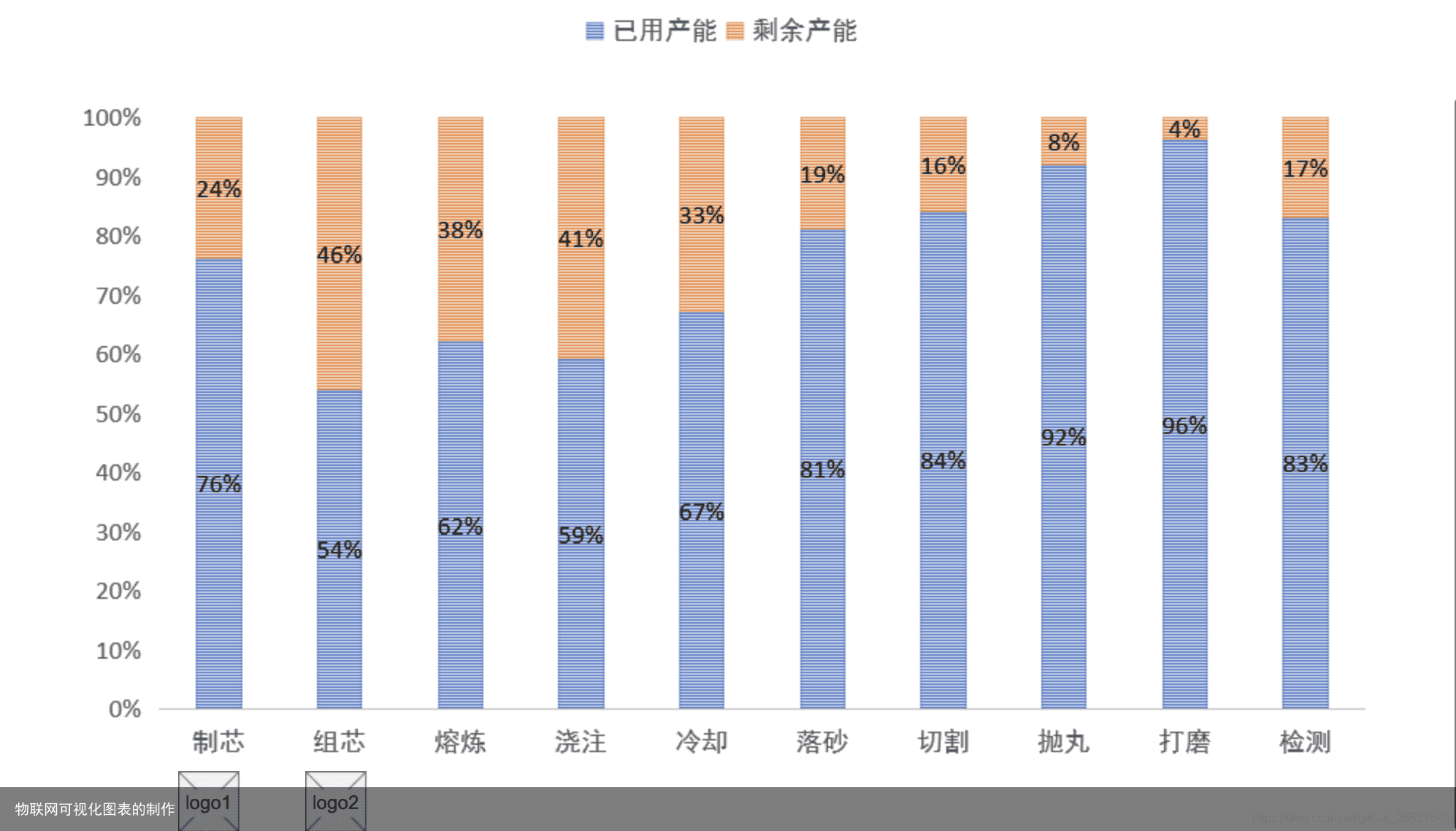
分析需求图1-2
需求图1-2 难点是在贴图的处理上。 由于是一个类目累加的柱状图,又称堆叠柱状图。因此可以基于该图例改造实现。 堆叠柱状图 堆叠柱状体 主要是在 series 中设置该属stack: total, 及可将同样设置stack: total 的series 。堆积起来。 此外,该图例需要开始 贴图。不开启,设置了贴图是不会显示的。 aria: { enabled: true, decal: { show: true, } }
设置蓝色的 已用产能 贴图。 itemStyle:{ decal:{ symbol: rect, symbolSize: 1, maxTileWidth:512, maxTileHeight:512, symbolKeepAspect: true, dashArrayX: [1,0], dashArrayY: [2,2], color: #5470c6, // rotation: 0.5235987755982988 } }
有关 属性decal 的更多解释 请看。 decal详细解释 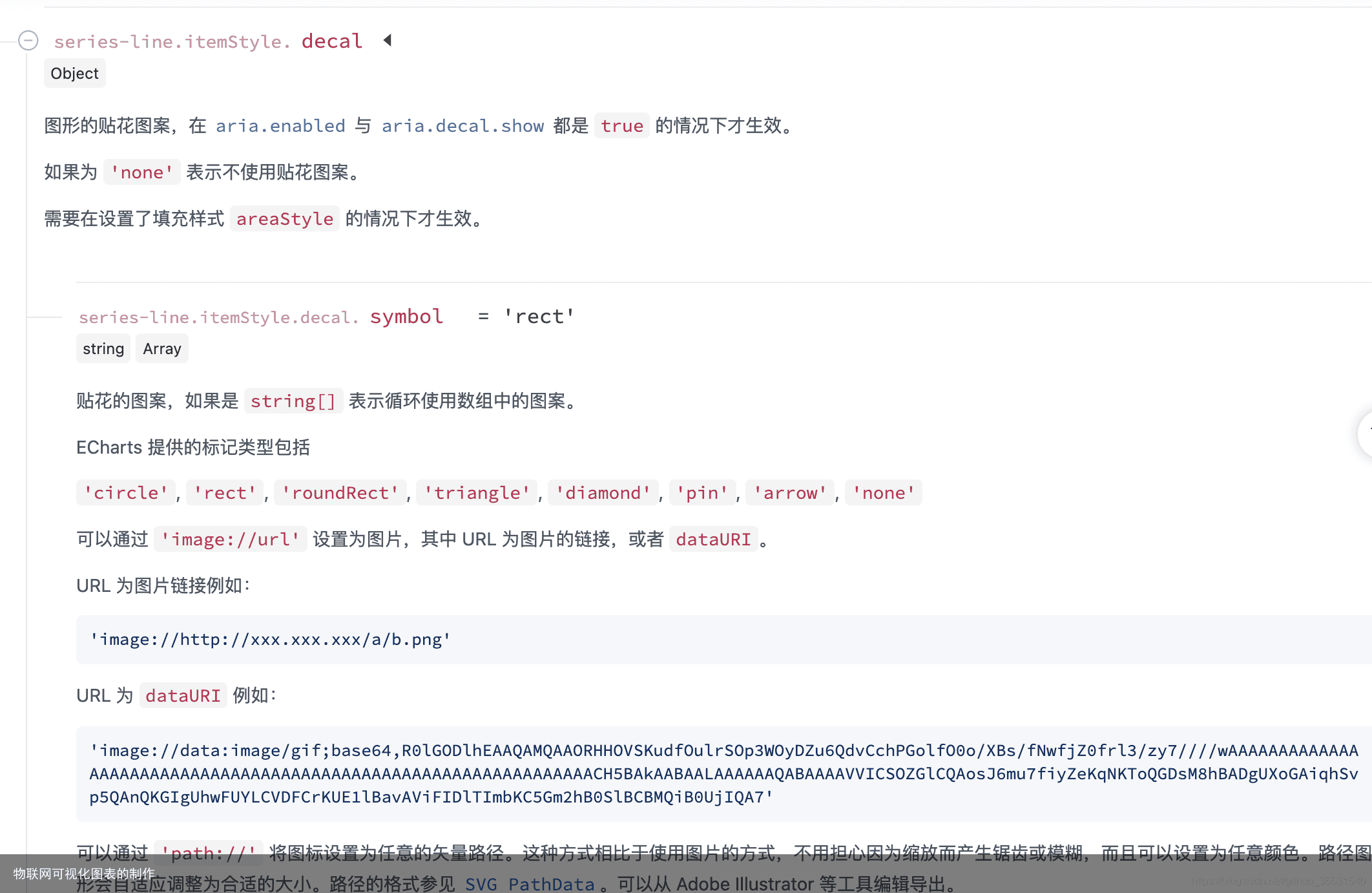
代码
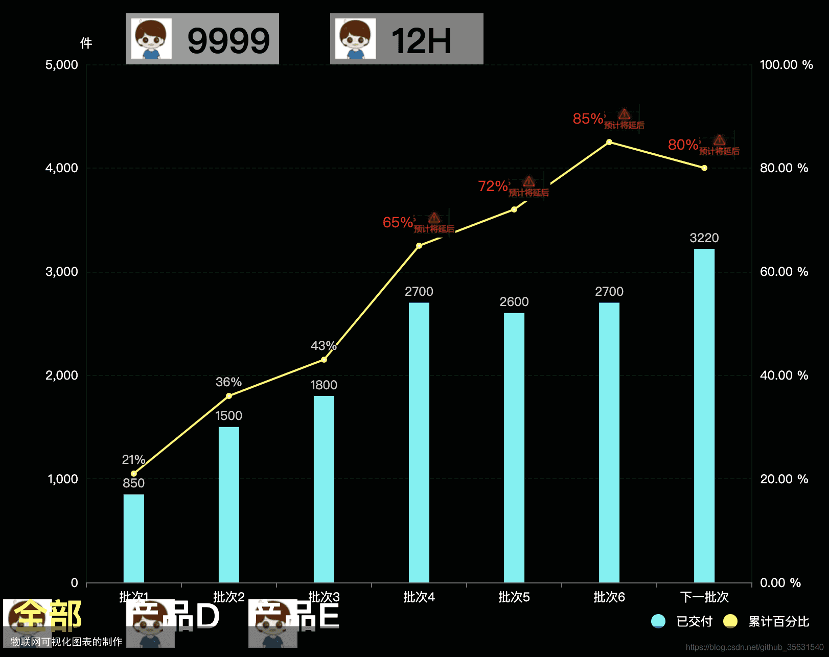
图1-1的核心代码 const allData = [] //[21,36,43,65,72,85,92] // [850,1500,1800,2700,2600,2700,3220] const proD = [] const proE = [] const dataseSource = [ [product, 已交付, 累计百分比], [批次1, 850, 21], [批次2, 1500, 36], [批次3, 1800, 43], [批次4, 2700, 65], [批次5, 2600, 72], [批次6, 2700, 85], [下一批次, 3220, 80], ] option = { color: [#53f3f3, #fff85f, #EE6666], textStyle: {color: #fff}, backgroundColor: #020403,//背景色 dataset: { source: dataseSource, }, graphic: { elements: [ { type: rect, x: 120, y: 10, shape: { width: 150, height: 50 }, style: { fill: rgba(255,255,255,.6) } }, { type: rect, x: 320, y: 10, shape: { width: 150, height: 50 }, style: { fill: rgba(255,255,255,.5) } }, { type: image, style: { image: data:i yf8A/9k=, x: 325, y: 15, width: 40, height: 40 }, onclick:function(data){ console.log(data) } }, { type: text, x: 180, y: 20, style: { fill: #000, text: 9999, font: bold 34px Microsoft YaHei, }, onclick:function(data){ console.log(data) console.log( arguments) const { target} = data; target.style.text = Math.floor(Math.random()*1000)+””; } }, { type: text, x: 380, y: 20, style: { fill: #000, text: 12H, font: bold 34px Microsoft YaHei, } }, { type: image, style: { image: data:image/png; /9k=, x: 125, y: 15, width: 40, height: 40 } }, { type: group, bottom: 20, children: [ {type: image,style:{image:dat A/9k} }, {type: text, left:10, style: { fill: #fff85f, text: 全部, font: bold 34px Microsoft YaHei,}} ], onclick:function(data){ console.log(data) } }, { type: group, bottom: 20, left: 120, children: [ {type: image,style:{image:d 9k} }, {type: text, style: { fill: #fff, text: 产品D, font: bold 34px Microsoft YaHei,}} ], onclick:function(data){ console.log(data) } }, { type: group, bottom: 20, left: 240, children: [ {type: image,style:{image: 9k} }, {type: text, style: { fill: #fff, text: 产品E, font: bold 34px Microsoft YaHei,}} ], onclick:function(data){ console.log(data) } }, ] }, tooltip: { trigger: axis, axisPointer: { type: cross, crossStyle: { color: #999 } } }, legend: { bottom: 20, right:20, textStyle:{color:#fff}, data: [ {name: 已交付,icon: circle}, {name:累计百分比,icon:circle}] }, xAxis: [ { type: category, axisPointer: { type: shadow } } ], yAxis: [ { type: value, show:true, name: 件, min: 0, max: 5000, axisLine:{ show: true, lineStyle:{ color: #02180b } }, splitLine: { lineStyle: { type: dashed, color: #02180b, } } }, { type: value, name: , min: 0, max: 100, axisLabel: { formatter: {value}.00 % }, axisLine:{ show: true, lineStyle:{ color: #02180b } }, splitLine: { lineStyle: { type: dashed, color: #02180b, } } } ], series: [ { name: 已交付, type: bar, barWidth: 20, label: { show: true, position: top, valueAnimation: true, } }, { name: 累计百分比, type: line, label: { show: true, distance: 5, rich:{ red:{color:red,fontSize:14}, b: { backgroundColor: { image: https://img-blog.csdnimg.cn/2021070312161116.png }, height: 30, }, }, formatter: function(params) { const { data } = params; const value = data[2] if (value > 50) { return “{red|” + value + “%}{b| }” } return value+”%” } }, yAxisIndex: 1, } ] };
<
图1-2的核心代码 option = { // color: [#5470c6, #fac858], color: [#fff, #fff], legend: { data: [已用产能, 剩余产能] }, xAxis: { type: category, data: [“制芯”,”组芯”,”熔炼”,”浇注”,”冷却”,”落砂”,”切割”,”抛丸”,”打磨”,”检测”] }, yAxis: { type: value, axisLabel:{ formatter: {value}% } }, series: [ { name: 已用产能, type: bar, stack: total, label: { show: true, formatter:{c}% }, emphasis: { focus: series }, data: [76,54,62,59,67,81,84,92,96,83], itemStyle:{ …. } }, { name: 剩余产能, type: bar, stack: total, label: { show: true, formatter:{c}% }, emphasis: { focus: series }, data: [24,46,38,41,33,19,16,8,4,17], itemStyle:{ decal:{ …. } } }, ], aria: { enabled: true, decal: { show: true, } } };
<
将代码复制到 echarts的编辑器里就可以实时预览效果了。 https://echarts.apache.org/examples/zh/editor.html?c=line-simple
后续的我会给大家详细讲解echarts中的贴花。 这是一个非常具有表现力,并且可以玩出花的特性。 大家敬请期待。
免责声明:文章内容来自互联网,本站不对其真实性负责,也不承担任何法律责任,如有侵权等情况,请与本站联系删除。
转载请注明出处:物联网可视化图表的制作 https://www.yhzz.com.cn/a/12051.html